
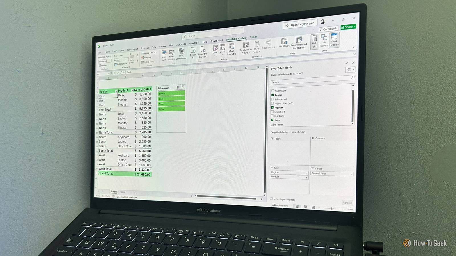
PivotTables have a reputation for being one of Excel's most intimidating features, but they're really just drag-and-drop tools for summarizing data.Once you understand the basics, you can turn thousands of rows into clear, meaningful reports in minutes while exploring your data without ever changing the original spreadsheet.Prepare your data and create your PivotTable Clean source data is the key to accurate reports Before you create a PivotTable, make sure your data is properly structured.
Every column should contain one type of information, such as Date, Product, Region, or Sales, while every row should represent a single record.Check these four things first: Every column needs a unique header.Don't leave blank rows inside the dataset.
Keep dates formatted as dates and numbers formatted as numbers.Convert the raw range into an Excel table (Ctrl+T or Insert > Table).Since tables automatically expand when you add new rows, refreshing the PivotTable includes any new data without forcing you to rebuild your layout from scratch.
Close Once your data is ready, you can create your PivotTable: Select any cell inside your Excel table.In the Insert tab, click the top half of the split PivotTable button.You can place the PivotTable in a new or existing worksheet.
I usually choose New Worksheet, so my source data and analysis stay on separate sheets in the same workbook.Click OK to open a blank PivotTable.Close Demystifying the PivotTable Fields pane Control your numbers with simple checkboxes Your new PivotTable will look blank at first because you haven't told Excel what to summarize yet.
The PivotTable Fields pane controls your PivotTable, listing your source columns at the top and the four report areas below.You can either check the box next to a field name and let Excel place it automatically, or drag fields into one of these four areas: Rows: This displays your categories down the left-hand side of the report.Columns: This displays categories across the top of the report.
Values: This is where Excel calculates your results.Numeric fields are usually summed automatically, while text fields are counted instead.Filters: This adds a filter menu above your PivotTable, letting you isolate the entire report based on specific criteria.
As you do this, the PivotTable updates instantly.Remember, PivotTables will never alter your source data, so keep rearranging the fields until your data tells the story you need.Close If you don't see the PivotTable Fields pane, click anywhere inside your PivotTable, open the PivotTable Analyze tab (see the section below), and click Field List.
You can also drag the same field into the layout more than once.For example, if you drag a "Sales" field into the Values zone twice and click the drop-down arrow next to the duplicate, you can click Value Field Settings to switch between sum, count, average, max, or min.If you change your mind, remove a field by clicking the drop-down arrow beside the field name and selecting Remove Field, or by dragging and dropping the field out of the area it's currently in.
Close Microsoft 365 Personal OS Windows, macOS, iPhone, iPad, Android Free trial 1 month Microsoft 365 includes access to Office apps like Word, Excel, and PowerPoint on up to five devices, 1 TB of OneDrive storage, and more.$100 at Microsoft Expand Collapse Master the PivotTable Analyze tab Dynamic filters and instant updates When you click inside your PivotTable, the PivotTable Analyze tab appears on the ribbon.Among other tools, this tab lets you refresh your data and add interactive filters.
If your source data changes, you need to refresh your PivotTable by clicking the Refresh button or pressing Alt+F5.If your workbook contains multiple PivotTables or external data connections, expand the Refresh drop-down menu and click Refresh All to update everything at once.Close Instead of relying only on the small filter buttons inside your PivotTable, you can use slicers, which are more interactive.
These visual filters let you click buttons to instantly show specific categories, such as a particular region or product.To insert them: In the PivotTable Analyze tab, click Insert Slicer.Check the box for the column you want to filter by.
When you click OK, Excel places an interactive button panel on your sheet.You can then click the buttons to instantly filter your PivotTable and focus on specific categories.Close Hold Ctrl while clicking slicer buttons to filter by multiple items instead of just one.
If your PivotTable contains dates, you can also add a timeline.These work like slicers but are designed specifically for filtering time-based data and let you quickly switch between years, quarters, months, or days.To add one: In the PivotTable Analyze tab, click Insert Timeline.
Select the date field you want to use for filtering.When you click OK, Excel adds the timeline to your worksheet, which lets you filter your PivotTable by years, quarters, months, or days.Click the Clear Filter button in the top-right corner to reset the timeline.
Close If your PivotTable displays individual dates instead of useful time periods, you can group them together.Right-click any date inside your PivotTable, select Group, then choose whether you want to summarize your data by months, quarters, years, or another interval.Customize layouts via the Design tab Transform boring grids into professional reports The Design tab lets you alter the aesthetic and structural presentation without changing the underlying math.
By default, PivotTables use Compact Form, which nests multiple row fields into a single column.Switching Report Layout to Tabular Form gives each field its own column, making your reports much easier to read.Close You can also use the PivotTable Styles gallery in this tab to quickly change the appearance of your report.
These built-in styles adjust colors, borders, and shading without affecting your data or calculations.Close Take your PivotTable skills further Explore your data with these built-in shortcuts Once you're comfortable with the basics, there are plenty of other things you can do with PivotTables.These are three of my favorite features for uncovering more insights without creating additional formulas or reports: Double-click values to reveal source data: If you want to investigate where a number came from, double-click any value inside your PivotTable.
Excel creates a new worksheet containing every source row that contributed to that result, making it easier to validate unexpected numbers or investigate trends.Show values as percentages: PivotTables don't just have to show totals.Right-click any value, select Show Values As, and choose options like % of Grand Total to see how much each category contributes to the overall picture.
Create PivotCharts from your summaries: Turn your PivotTable results into interactive visuals by clicking PivotChart in the PivotTable Analyze tab.The chart updates automatically as you rearrange fields or apply filters, helping you spot trends more easily.These features help you move beyond simple summaries and use PivotTables as a more flexible tool for exploring and presenting your data.
Go beyond single-table analysis PivotTables become much less intimidating once you realize they're simply different ways of viewing the same data without rebuilding your reports.And when your analysis grows beyond a single table, Excel's Data Model lets you connect related datasets so you can build PivotTables from multiple sources without manually combining everything first.
Read More