I've built Excel dashboards for years, and almost every one relied on some combination of XLOOKUPs, dynamic arrays, SUMIFS, helper columns, and other worksheet formulas.So I challenged myself to build a dashboard without writing a single worksheet formula, and it completely changed how I'll approach them in the future.To test the idea, I built a dashboard around my movie-watching history, linking my viewing log to a movie database.
Instead of combining everything into one giant worksheet, I wanted to see whether Excel's built-in Data Model could handle the relationship for me.I let Excel connect my data instead One connection replaced thousands of cells Close The first step I would usually take was to add columns to my raw data and use formulas to bring in details from my database.This often meant filling thousands of cells with XLOOKUP statements before I even started building the dashboard.
It was a habit I picked up early in my spreadsheet career: flatten everything into one large table first, then analyze it.This time, I converted both datasets into Excel tables, then added them to the Data Model.There, I connected the "MovieID" fields between the two tables in Diagram View.
As a result, instead of repeating the same movie details across thousands of rows, I created a single connection.Related Power Query's real superpower isn't cleaning data—it's combining it without formulas Replace repetitive copy-paste work by automatically combining, joining, and importing data directly inside Excel.Posts By Tony Phillips The obvious next step was seeing what I could build from it.
I inserted my first dashboard PivotTable from the connected tables, dragging "Genre" from the "Movies" table and counting "ViewingID" records from the "ViewingHistory" table.This produced a clean breakdown of my viewing habits, which I then sorted by the number of views.That small test proved the entire concept.
The movie information lived in one table, the viewing activity lived in another, and Excel combined them through the relationship I had created.This made it clear that in eliminating formulas, I was actually eliminating unnecessary work.One successful summary snowballed into the entire reporting hub PivotTables became the engine for every metric Close Like many dashboard builds, mine usually became harder to manage as more metrics were added.
If I wanted totals by genre, platform, year, or movie, I'd create another calculation area, then build visuals around those results.Every new metric meant another set of formulas to create, format, and check.However, here, because I had already built the Data Model, creating new dashboard metrics became a case of choosing the fields I wanted to analyze rather than building another calculation layer.
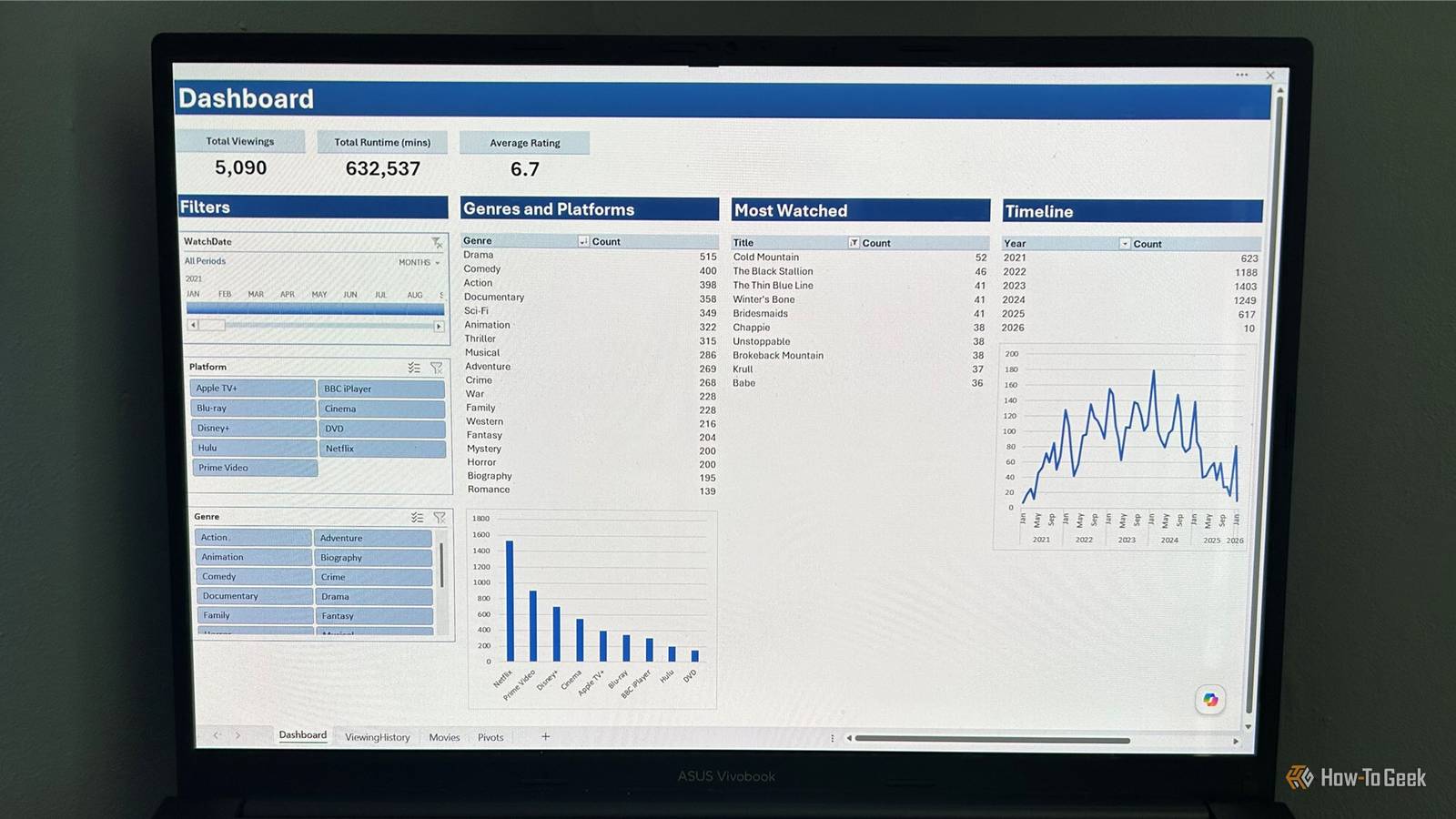
Using this workflow, I created: A top 10 most-watched movies ranking using "Title" from the "Movies" table and "Count of ViewingID" from the "ViewingHistory" table.I sorted the PivotTable by viewing count and used the built-in Top 10 filter to show only the most-watched titles.A year-by-year viewing trend using "WatchDate" from the "ViewingHistory" table.
Grouping the dates by year turned thousands of records into a simple timeline showing how my habits changed over time.KPI cards showing things like total viewing sessions, total watch time, and average personal rating.The biggest change was that I no longer needed to decide which formula was the right tool for each problem.
Yes, the tables and KPI cards still needed tidying up, but I could see things were starting to take shape.I built charts without creating formula-driven tables Every visual stayed connected to the summaries I had already created Close In my previous dashboard builds, creating a chart usually meant building lookup formulas to enrich the raw data, creating separate summary ranges, then pointing my charts at those results.The chart itself was rarely the difficult part—the work was creating and maintaining the data behind it.
This time, the PivotTables I already created became the foundation for many of my visuals—in this case, PivotCharts.For charts that needed a different view of the data, I also created a separate Pivots worksheet containing supporting summaries that didn't need to appear on the dashboard.For example, I created a PivotTable showing viewing activity by platform, then turned it into a column chart.
I created another showing viewing trends by month using the "WatchDate" field from my "ViewingHistory" table, grouping the dates so Excel could display how my viewing habits changed over time.Each PivotTable was created from the same connected model, meaning I could build new views of my data without adding another layer of formulas.What struck me most was how much hidden maintenance work had disappeared from behind every visual.
The Data Model handled the relationships, PivotTables handled the calculations, and PivotCharts turned those results into visuals.Slicers made the dashboard feel like a BI tool Filters became effortless visual controls Close Adding interactivity in Excel often means inserting data validation drop-down lists, FILTER formulas, or additional helper areas.These work, but they create more moving parts that need maintaining.
Because my dashboard was built from PivotTables connected to the Data Model, I could add interactive controls without creating any additional calculations.I inserted Slicers for platform and genre, then added a Timeline control for filtering by watch date.Related Your Excel PivotTable isn't complete until you add these two pro-level features Stop treating PivotTables as the finish line—add Slicers and Timelines to turn your spreadsheet into an interactive dashboard.
Posts By Tony Phillips Once I connected those controls across the dashboard, I could combine multiple filters at once, narrowing my dashboard to a specific genre on a particular platform within a certain time period.Excel handled each interaction automatically, without requiring additional formulas or helper columns behind the scenes.The moment I realized I could explore thousands of viewing records by clicking a few buttons, the workbook started behaving like a lightweight, purpose-built app.
I added new viewing data without rebuilding anything One refresh, zero repairs Close After adding the final formatting touches to my dashboard—like resizing columns so PivotTable details weren't cut off, renaming the PivotTable fields, hiding unnecessary PivotChart field buttons, and aligning Slicers into a clean navigation panel—it was time to test whether the whole thing would update when I added more viewing data.The real test of any dashboard isn't how it looks, but how easily it handles fresh data.In a formula-driven dashboard, this was the point where I would normally check whether formulas had copied down correctly, calculation ranges included the new records, and every summary still captured the latest information.
Before testing the refresh, I enabled Excel's options to preserve PivotTable formatting and stopped automatic column resizing, preventing my carefully arranged dashboard from changing every time the data updated.Then, I pasted another month of viewing records into my "ViewingHistory" table and clicked Refresh All on the Data tab.This updated the Data Model with the additional records, recalculated every PivotTable, updated the charts, and expanded the Timeline to include the new dates.
I'm changing how I approach every dashboard I build The biggest lesson from this dashboard wasn't that formulas are bad—it was that I had been solving dashboard problems at the worksheet level when Excel had better tools built in.From now on, I'll approach dashboards differently: clean tables first, relationships second, and visuals last.To finish this workbook, I'll add a README sheet explaining how everything works and a table of contents to make navigation easier, especially if I ever share it with others, use it as a template, or return to it months later.
Read More