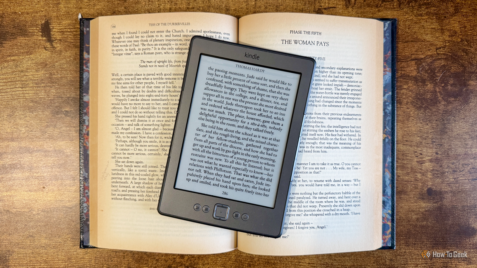
A Kindle can offer a lot of convenience, but it can't match the magic of a real physical book.By installing KOReader on my jailbroken Kindle, I was able to make a lot of tweaks to the font, spacing, and headers and footers of my eBooks to make them resemble real books as much as I could.Add How-To Geek on Google Add as Preferred Source Follow on Google Discover Using the right font makes the biggest difference NV Garamond was my font of choice The change that had the biggest immediate impact was choosing the right font.
The default fonts for Kindles make reading easy, but they don't always match the look of real books.I wanted to find a font that gave the closest match to the hundreds of books on my shelves.I set this up on my old Kindle 4, which is now jailbroken after Amazon dropped support for the device, removing access to many of the most useful features.
I installed the excellent KOReader software, which is now my reading app of choice.I'd already installed the Storefront plugin that makes it easy to install other useful plugins directly from the Kindle, and the same tool also allows you to download and install fonts, too.In the end, I opted for the NV Garamond font.
This is similar to the EB Garamond font but is designed to look more like the text from hardback books.As soon as I switched an eBook to this font, it already looked far more like a real book.Related My jailbroken Kindle is the ultimate distraction-free writing terminal From read-only to write-enabled.
Posts By Adam Davidson Getting the spacing right took some experimentation A real book has plenty of empty space Close The next thing I did was make a few changes to the font.I increased the font weight a little as it looked fainter than the printed text in real books.I also adjusted the word spacing and line spacing to match my real books as closely as I could.
The next stage was to adjust the margins.Real books have a surprisingly large amount of space around the text, and due to the way that they are bound, the margin on one side is usually a little wider than the other.I played with the left and right margin values, making the left margin a little wider, until I was happy with the result.
The final change before I tackled the header and footer was to change the text alignment.I chose the options to justify most text and to allow hyphenation of all text, since these settings most closely matched how the books from my shelves were justified.I ended up changing a large number of settings, shown in the table below.
These settings may not work for your specific Kindle model, but they could give you a useful starting point to work from.Setting Value Body font NV Garamond Body font size 24 Body font weight +1 Font hinting Native Font kerning Best Word spacing Medium Word expansion None Line spacing 105% Left margin 55 Right margin 40 Top margin 55 Bottom margin 29 Sync top and bottom margins Off View mode Page Render mode Book Hyphenation On Ignore publisher page margins On Bookends Enabled Top Bookends line Centered; book title on odd pages, author on even pages Top Bookends font NV Garamond Regular, size 20 Bottom Bookends line Centered page number Bottom Bookends font NV Garamond Regular, size 20 Bookends top and bottom margins 10 each Bookends left and right margins 18 each Bookends font scaling 100% Clock and battery overlays Off Bookends progress bars Off KOReader stock status bar Disabled through Bookends The Bookends plugin helped add the finishing touches Alternating headers make it feel like a real book The final step was to set up the header and footer of the page.In a real book, the footer is often the page number, but the header can vary from book to book.
Some books alternate between the book title and author, some between the book title and chapter name, some between the book series and book title, and some don't have any header at all.In the end, I opted to display the book title and book author, alternating from page to page, since not every book has chapter names, but they all have titles and authors.To make this happen, I used another KOReader plugin called Bookends, which lets you customize the headers and footers of your eBooks.
Using Bookends, I set up the top-center field using the code [if:page=odd]%title[else]%author[/if].This makes KOReader display the book title on odd pages and the author on even pages.I made the text a little smaller than the main body and made it all caps, as I'd seen done in some real books.
I was very pleased with the end result.The final phase was to use Bookends to add the page number in the footer, in the same NV Garamond font.This gave me a page that looked as close as I was able to get to a page from a real paper book.
A Kindle can't replace a real book, but it can at least look like one The right settings can make the experience as book-like as possible I love real books, and I still prefer reading a physical book to using an eReader.There's just nothing quite like the feel, the weight, and even the smell of a paper book.Devices such as Kindles offer too much convenience to ignore, however.
By taking the time to change how eBooks are displayed on my jailbroken Kindle, I've managed to make my Kindle feel as close to a real book as I possibly can.I'd still always choose a physical book over an eBook in a heartbeat, but when I'm using my Kindle, these settings can almost convince me that I'm not reading from an electronic device.KOReader has made my Kindle so much better While a Kindle offers some customization, using KOReader on a jailbroken Kindle offers far more.
I've been able to set up my eBooks exactly how I want them, in a way that I was never able to when using the stock firmware.KOReader really has made my Kindle far better than it ever was before.
Read More