Google changed how you interact with Android, ditching the old navigation bar for a new, edge-to-edge gesture system.The industry buzz was that buttons were an old, somewhat clunky feature, meant for replacement by the more fluid, intuitive motions of a swipe.However, that promised fluidity hasn't quite come to be, and the three-button system is still better.
An essential tool like this needs to be perfect, and wanting a minimalist navigation bar has instead given you an unreliable system.There are many reasons why I don't want to use the gesture-based standard, and the experience has not gotten better over the years.How Gestures Broke App Navigation Gestures are not the answer Moving from dedicated, button-based navigation to a gesture-heavy interface really broke a key part of how you expect an interface to work.
There is a serious conflict between Android's system-level Back gesture and the internal design of thousands of existing apps.When Google removed the separate navigation bar at the bottom of your phone, it made system navigation commands share the exact same physical touch space as an app's content window.This overlapping of input zones forces a constant gesture collision, where the software has to keep guessing what you're trying to do.
That causes frequent errors that just weren't there when navigation was physically separated from the app space.For years before gesture navigation came along, Android developers taught you to interact with the edges of your screen to move around in apps.A great example is the classic hamburger menu, or navigation drawer, which you'd open by swiping inward from the left edge of the screen.
When Google gave the universal Back command to that same left-edge swipe, it created a functional overlap.All of a sudden, an action meant to just open a menu would trigger the system Back command instead, accidentally closing the app or moving you away from your view.Instead of fixing this basic overlap by only keeping the restricting edge swipes to system navigation, Google brought in awkward, temporary solutions that put all the work of being precise on you.
To get around the Back command and successfully open a side menu, you're told to swipe downward at a 45-degree angle, or to awkwardly press and hold the edge of the screen for a few milliseconds before you start your swipe.These mechanisms are clunky, inconsistent, and really unpredictable for most people.While Google eventually let developers define specific exclusion zones on the screen where the Back gesture is ignored, this depends on thousands of individual developers perfectly updating their apps to prevent collisions.
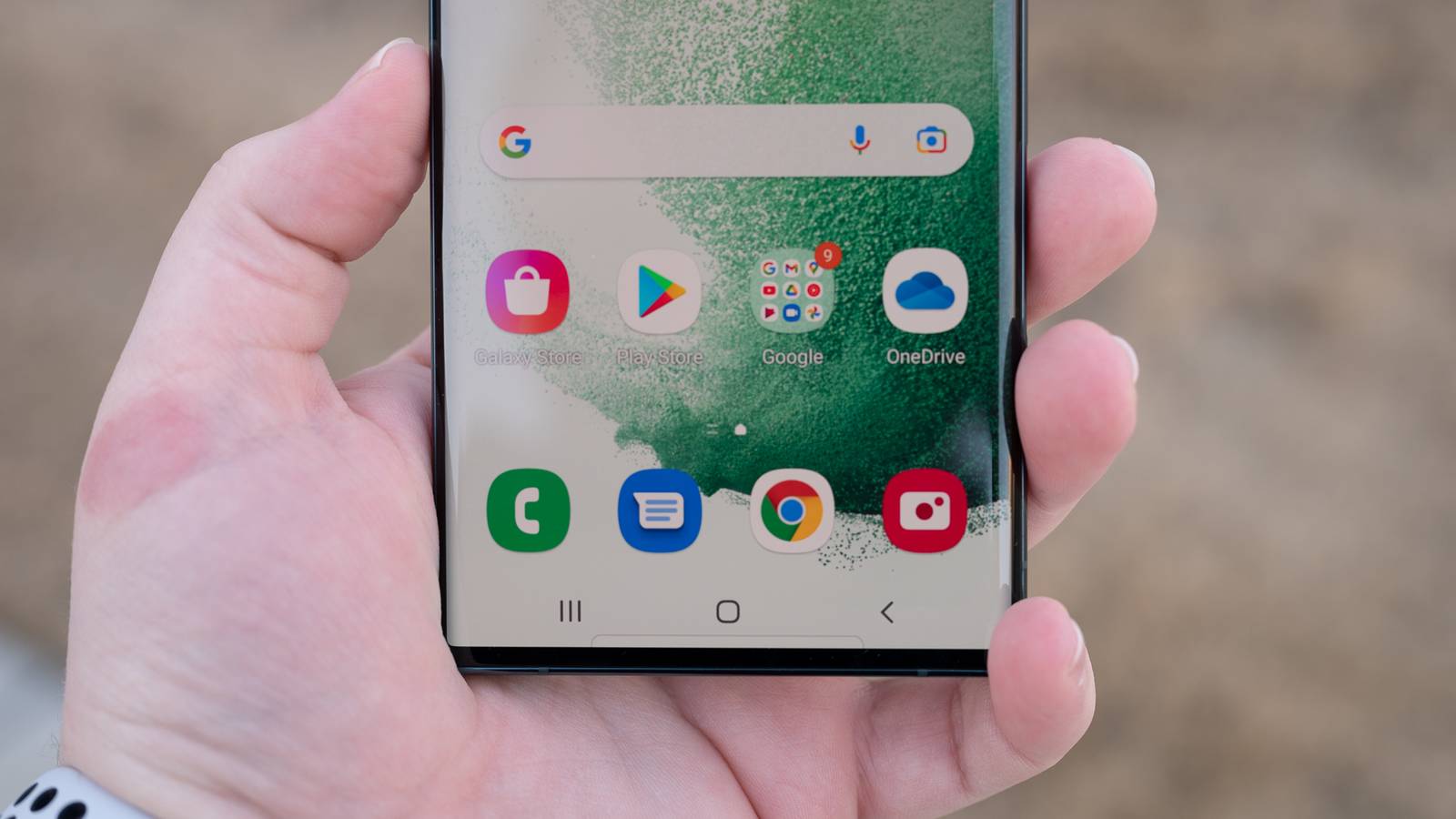
Why Three Buttons Are Still Faster for Users Buttons have never been beaten A traditional navigation button works like a fixed spot on the screen, only needing a single tap with no travel time.Because this input doesn't depend on timing or complicated movements, it registers the moment your finger touches and releases the screen.This simple, on-off interaction lets you get a level of speed that gestures just can't match, because your device only needs to register a simple, quick tap instead of figuring out the path and length of a swipe.
The difference in speed gets even more obvious when you're managing background applications.With three-button navigation, getting to your open apps is just a single tap, and you can instantly switch between your two most recent apps with a quick double-tap.Gestures replace this seamless efficiency with an awkward action that needs you to swipe up from the bottom, pause briefly, and then let go.
If you don't hold the gesture for just the right amount of time, the operating system misunderstands the action and just sends you to the home screen instead.So you are unnecessarily penalized and slowed down, needing to redo everything just to get what you want.Other than the milliseconds lost to fluid animations, there's a big difference in how much mental effort these two navigation types need.
The muscle memory you develop by always hitting a fixed spot on the glass is mentally much less tiring than doing sweeping gestures.Traditional buttons let your thumb aim for a reliable, unchanging spot on the screen, creating an automatic reflex.Gestures, on the other hand, require a rhythmic motion that constantly changes based on where your thumb is currently resting on the glass.
You're forced to consciously judge your movement to make sure you swipe far enough or hold long enough to trigger the right action without accidentally doing a different command.Why "Good Enough" Navigation Isn't Enough Reliability should have been the priority A smartphone is probably the most important tool you have, and you need it to work every single time.Gesture navigation just doesn't meet that standard.
The old three-button navigation gave you that certainty; when you tapped a button, your phone knew exactly what you wanted to do right away.With gestures, though, there's a noticeable pause because your phone has to guess what your swipe means by how fast, long, and angled it is.While this interpretive model might seem okay for just looking at something casually or reading at your own pace, it just doesn't have the precision you need for important multitasking or easy accessibility.
When you're using your phone for hours every day, the unpredictable nature of gestures starts to wear on you.Subscribe for clearer takes on Android navigation UX Want reliable, practical insights? Subscribe to the newsletter for clear, evidence-based perspective on Android navigation and broader mobile UI trade-offs, helping you make informed choices about interfaces and design.Get Updates By subscribing, you agree to receive newsletter and marketing emails, and accept our Terms of Use and Privacy Policy.
You can unsubscribe anytime.When you look back at the last six years, it's pretty clear that the shift happened because everyone wanted thinner bezels and big, edge-to-edge screens, not because they made interacting with your phone better.It was mostly an aesthetic trend that put having the biggest screen possible ahead of clear functionality.
By trying to pack several different actions into an invisible bar that changed based on what you were doing at the bottom of the screen, Android swapped a very functional, easy-to-understand control system for a sleeker appearance.The later addition of awkward fixes, like back sensitivity settings, only shows how flawed the idea of overlapping touch zones is at its core.Swapping a guaranteed button press with a vague swipe means giving up usability just for aesthetics.
When the main way you interact with your digital world becomes a guessing game of timing and tiny movements, your interface has failed its main job, proving that for smartphone navigation, just looking appealing in a marketing picture simply isn't enough for real-world reliability.Bring back buttons Even after six years and tons of updates, Android's gesture navigation still has a big problem.If an interface needs you to guess what it's trying to do, it can't be an efficient tool.
The simple, fixed-target taps you get with three-button navigation are a faster and less mentally tiring way to interact.When you need speed, precision, and no confusion, the old three-button bar really shows what good human-machine interface design looks like.Until gesture navigation can be 100% certain about every interaction, it'll stay a flawed experiment many of us won't participate in.
Google Pixel 7-5G Android Phone - Unlocked Smartphone with Telephoto Lens, Wide Angle Lens See at amazon See at bestbuy See at target Expand Collapse
Read More