
I've been building Excel dashboards for years, and my method has changed almost as much as Excel itself.One day I'll build one with formulas, the next I'll use only refined PivotTables, and increasingly, I'll ask AI to do the heavy lifting.But recently, I've found myself getting into a bit of an AI prompt trap.
Is it better to give it more information and direction? Should I get into a back-and-forth conversation? Or should I just keep things simple? When it comes to Copilot, I think I've finally landed on the approach that works best for me: give it the goal, then get out of the way.I let Copilot analyze my data first Its findings started shaping the dashboard Close I started with what seemed like the most logical approach: let Copilot figure out what was interesting before building anything.I gave Copilot in Excel a workbook containing 5,000 movie-viewing records and asked it to analyze the data, identify interesting patterns, and then build a dashboard around its findings.
It found plenty to work with.I had watched 878 unique movies across those 5,000 records, with 82.4% of the viewing records being repeat watches.Viewing volume peaked in 2023, Netflix's share of my viewing changed over time, and completion rate had almost no relationship to my ratings.
Copilot in Excel then turned those findings into a dashboard with six summary cards, six slicers, and four charts.And to be fair, it worked.It looked good, it was interactive, and it was easy enough to follow.
Related I built an Excel dashboard without writing a single formula Building around relationships instead of formulas made my Excel dashboard faster to create, easier to update, and more interactive.Posts 1 By Tony Phillips The problem was that the dashboard had started to reflect what Copilot found most interesting in this particular dataset—which was exactly what I'd asked it to do.Repeat viewing, for example, became a major part of the dashboard, with several slicers and charts dedicated to new-versus-repeat viewing and rewatching.
The repeat-viewing analysis was interesting.My problem was what had been left out to make room for it.Other metrics that might have been more useful to me had effectively been pushed aside because Copilot decided repeat viewing was the story worth investigating.
That's when I started to question whether I wanted my dashboard to be shaped by whatever happened to stand out most strongly when Copilot first looked at my data.I asked Copilot's chatbot to plan the dashboard The result was more comprehensive, but more complicated Close For my second attempt, I took a different route.Instead of asking Copilot in Excel to decide what mattered, I asked the web-based Copilot chatbot to analyze the data and recommend a dashboard.
Its recommendations were much more detailed.They covered viewing patterns, platforms, genres, ratings, completion, seasonal trends, several slicers, heat maps, scorecards, and additional calculations.So I fed those recommendations into Copilot in Excel and asked it to build the dashboard.
Once again, it did what I asked.This dashboard was more analytical than the first, with eight charts, two tabular visualizations, five slicers, five summary cards, and a current-filter insights area.Related I asked ChatGPT and Gemini to build an Excel dashboard—but only one truly delivered The winning AI wasn't the one with the better workbook—it was the one with the better blueprint.
Posts 6 By Tony Phillips But it was too much.To see all of that at once, even on my larger second monitor, I had to zoom out so far that the text became difficult to read.The dashboard no longer gave me the quick snapshot I wanted when I opened the workbook.
There was simply too much to take in.Then I thought about maintenance.I always test an AI-made dashboard before I trust it, and this one had a lot of charts, calculations, filters, and other components to check.
The more elaborate the dashboard became, the more work there was to make sure everything actually worked as intended.I also realized that some of the things the dashboard was helping me investigate could have been answered more quickly with a PivotTable or by sorting my source table.A dashboard is supposed to make working with data easier.
I didn't want to create another project for myself.I stripped the prompt back to the basics Less direction gave Copilot more freedom Close For my third test, I went in the opposite direction.Unlike my first test, I didn't ask Copilot in Excel to analyze the data and build the dashboard around whatever it found.
I simply gave it the basic information about my 5,000 movie-viewing records and asked it to build a useful interactive dashboard.That approach also lined up with something I'd found when I recently looked at OpenAI's updated prompting guidance: give AI a clear goal and let it work out the route rather than prescribing every step.Since Microsoft Copilot can use OpenAI models, I was curious to see whether that principle would apply here.
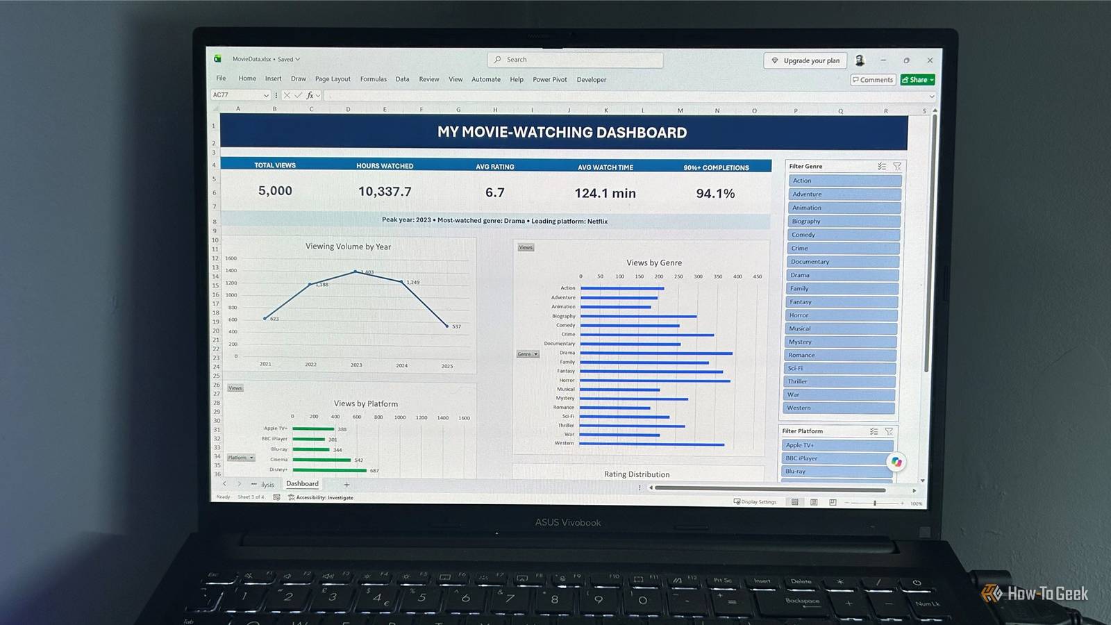
Related I hated Copilot in Excel, but these 3 tests made me change my mind Three practical Excel tests showed me Copilot had become more capable than I realized.Posts 1 By Tony Phillips The result was much simpler, but it still gave me plenty to work with.I had five summary cards showing the key numbers, four charts covering viewing volume by year, genre, platform, and rating distribution, and two slicers that linked into everything.
Copilot also added a useful summary line at the top, highlighting the peak year, most-watched genre, and leading platform.The supporting PivotTables were neatly positioned on a separate worksheet, so they were available when I needed them without taking over the dashboard.Best of all, it was compact enough to fit comfortably on my screen.
And because it's not built around any one finding in my current data, I shouldn't need to rethink the dashboard as my viewing history grows.It was also the quickest of the three to create.I ended up with the dashboard I actually wanted Less detail turned out to be more useful The first dashboard was shaped around Copilot's analysis, and the second was shaped around an even longer list of recommendations.
The third simply asked Copilot to turn my data into a useful dashboard.I could open the worksheet and immediately get a sense of what was happening.The five cards gave me the key numbers, the four charts showed the main patterns, and the two slicers let me explore the data without filling the screen with controls.
If something went wrong, there were also fewer charts, calculations, and other components to investigate.And because the dashboard wasn't built around one particular discovery in my current data, I can keep adding records without necessarily having to rethink the whole thing.Ultimately, I learned that giving Copilot more information doesn't necessarily result in a more useful dashboard.
A clear goal was all Copilot needed I recently changed my mind about Copilot in Excel.I wasn't convinced it was worth keeping, but the more I use it, the more I understand how it works, and it's actually more capable than I first realized.Now, this experiment has given me another useful lesson: I don't necessarily get better results by giving Copilot more instructions when I'm building an Excel dashboard.
In this case, the least prescriptive approach produced the dashboard I actually wanted.Sometimes, giving Copilot a clear goal, stepping back, and letting it work out the details is all the direction it needs.
Read More