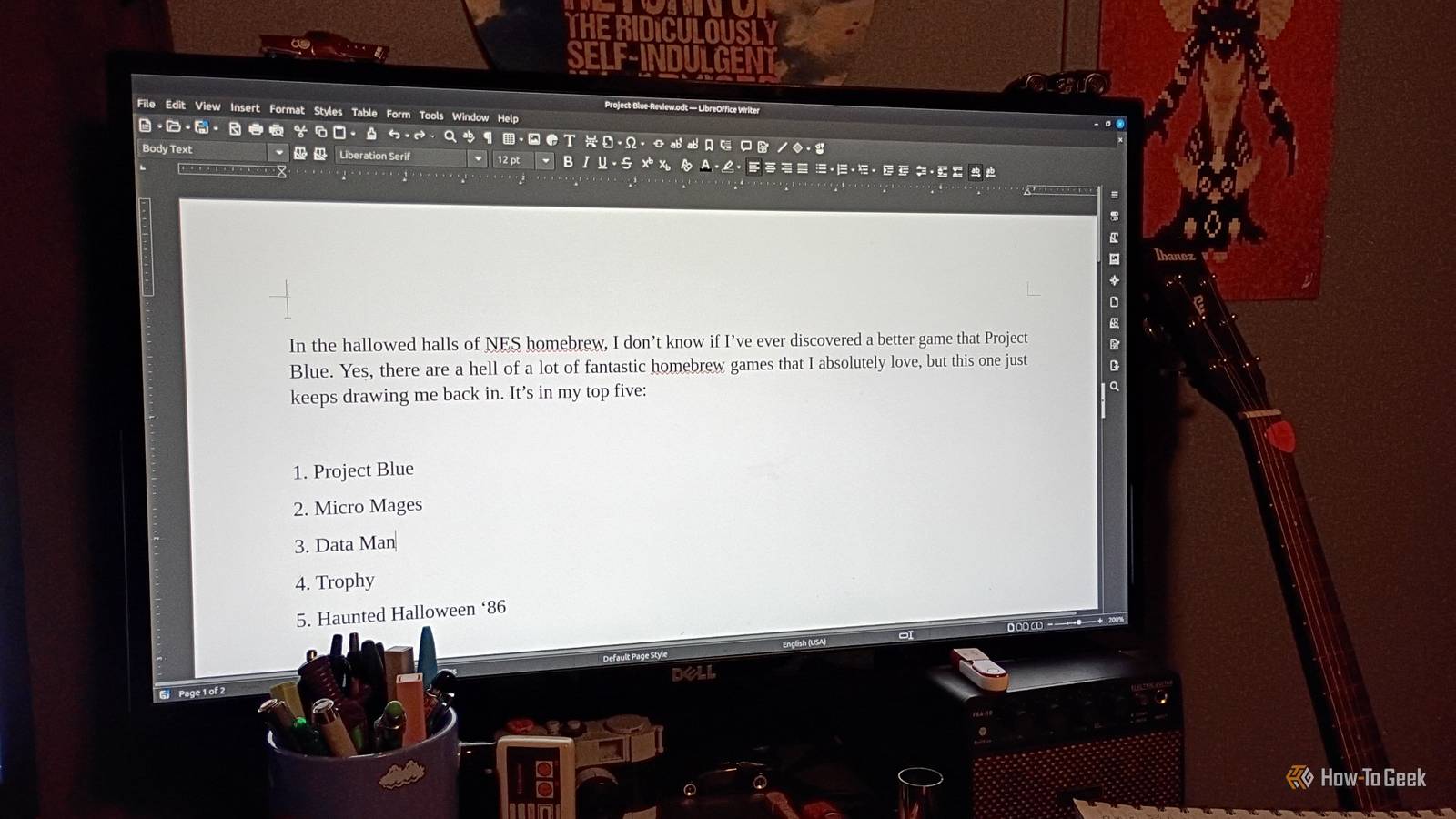
I love a good FOSS tool.LibreOffice has long been one of my go-to suites for work, both personal and professional.Used in conjunction with my other favorite productivity tool, Obsidian, I find that I can get a lot done.
The spreadsheet (Calc) is superior to Excel for my needs.I love the word processor (Writer), and I still use my old desktop publishing tools for major work, but I've converted to LibreOffice Draw for quick projects.But it does have some occasional hiccups, like paragraph justification in LibreOffice Writer.
I've certainly noticed it in the past, but learned that a recent update to LibreOffice fixed this text problem.It's noticeably different and very easy to use.Add How-To Geek on Google Add as Preferred Source Follow on Google Discover Justified text looks awful on old versions of LibreOffice And it's actually a technical issue with word processors in general Now, I'm not here to summarize all the changes made to LibreOffice.
But I do want to focus on the fix to justified text and why it was an issue for me in the past.I'll tell you that last bit right away: I like nicely formatted text that's easy on the eyes.Fonts, kerning, spacing, justification, and punctuation matter a great deal to me.
I kind of hyperfocus on it sometimes.Before this update, LibreOffice worked the same way as most other word processors.Justified text was evaluated line-by-line, which sometimes results in stretched text depending on how the software ends up evaluating the line.
When you hit justify on your text, it just looks weird sometimes.Sure, if you're just at a document or don't care about such things, you might not notice a difference.But it's there.
I can't unsee it.Interestingly, typesetters have been using the Knuth-Plass algorithm for the TeX typesetting system for decades to do virtually the same thing, so it's kind of odd that word processors are catching up.But, hey, I'll take it.
LibreOffice introduced the Paragraph Composer to tackle this issue My documents have changed for the better Close I took some screenshots for an example, using an older version of LibreOffice Writer.In the first two images, you'll see the text aligned to the left of the page.It looks alright at first glance.
The second image shows what it looks like with the alignment set to Justified.To my eyes, it appears slightly wider in the middle of the second line than it did before.I turned on the grid lines and a vertical ruler to double-check and grabbed two other screenshots.
It was the same thing.The first one showed the text aligned to the left as expected.But the second one had slightly wider text on the second line.
It takes close inspection to see, but it there.They're like rivers of white space between words that are hard to miss once you've spotted them.Admittedly, the old justify command, with its oddly-spaced text, was probably for most people.
But I want a professional look.The new LibreOffice update created what it calls the paragraph composer to tackle the justification issue.Instead of justifying text line-by-line, it uses a new layout algorithm that looks at multiple consecutive lines together, then balances the spacing between them across paragraphs.
Accessing the new feature is a breeze How to find the composer and what to do with it LibreOffice Writer has the new feature baked into it.You'll need the latest version of it, though.My initial tests were on version 24, which, admittedly, I should have updated a long time ago.
Hey, I got busy.I grabbed version 26.8.2 and installed it.Then I immediately opened the same document in Writer so I could take the paragraph composer for a test drive.
To enable the Paragraph Composer, go to Format -> Paragraph -> Alignment, then toggle Justified.At the bottom, you can toggle the Paragraph Composer on or off.Then select OK.
Now, you might be tempted to highlight the text you want to justify and hit CTRL +J to justify it.Don't.Toggling on Paragraph Composer in Justification mode automatically justified my text, so it'll most likely be the same for your document.
You'll notice the text doesn't look as wonky or "off" with rivers of white space.Instead, it's amazingly pristine.It looks good.
It's easy on the eyes, and the rivers of white space look much better.Nice.The Paragraph Composer was a quiet change, but a significant one.
And I have to say I've already noticed a difference in justified text.That makes reading my work easier on my eyes during the drafting process, for sure.Related LibreOffice has a new fix for your font problems Say goodbye to your document getting messed up over a font change.
Posts 2 By Jorge A.Aguilar A great app is now even better with a simple update Using LibreOffice has never been better, and it continues to improve.I'm very happy with the text justification changes.
I'm also excited about the variable font support for OpenType fonts, the new Draft view that lets you hide headers/footers, and some of the features they brought to other LibreOffice tools.If useful updates like this keep coming, I see no reason to switch to anything else.
Read More